Faro Health Internship
%20(3).png)
Role
Product Experience Intern
Timeline
Jun 2023 - Sep 2023
Team
Individual
Project 1: Slide Deck Design
Objective
To create slide deck templates to be used for customer training. One deck for introducing a feature and another for presenting a feature enhancement.
My Goals
-
Make sure the slide decks decrease the amount of effort my supervisor needs to put into every training presentation
-
Make sure it's clear how to use the slides and that it's easily replicable
-
Stay consistent with Faro's branding
-
Be consistent with color and typography throughout deck to avoid distraction or confusion
-
Use high color contrast when including text for legibility
-
Use visuals to aid the teaching process but keep them simple to avoid confusing the viewe
My Approach
-
I used references on the web to see how others have illustrated certain ideas and flow of information.
-
Then, I experimented on my own, creating multiple styles that suit Faro's purposes.
-
Since my supervisor would be the one to use the slides to create training content, I presented my iterations to him at our weekly meetings.
-
I refined and polished the presentation according to his feedback
Result
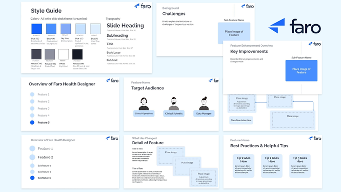
I created a style guide and created a couple of slides for reusable components to make elements of the deck easily replicable.

This is how I visualized the flow of presenting different features and their sub-features. The flow start from showing the features and sub-features in an inactive state. The next slide zooms into the contents of the first feature, with a dark blue fill signifying where you are in the presentation. After all sub-features of the first feature are presented, we zoom into the second feature's components, and so on... If this format gets complicated for the user, they can use the first slide and the fill colors to signify progress of the presentation without using the zoom format.
.jpg)
When delving into the background of each sub-feature, I kept the circle motif and the dotted line that connects the sub-features to give a sense of continuity. It's as though we've zoomed in on one of the circles. My supervisor wanted the main focus on the image of the sub-feature, so for the following slides I kept the name of the sub-feature alone.
.png)
Then, if this is a feature enhancement presentation, the presenter transitions to the updated version of the feature. In the first slide, an image of the sub-feature is highlighted in the center, with a darker blue back-drop than the older version from previous slides. In the slides following, kept the "Feature Enhancement Overview" text but shrunk and de-emphasized it to signal what topic the presenter is on.

I made two different formats for addressing the target audience. The one on the right allows viewers to put a face to each target. The avatar can then be used in later slides as a reference.
.png)
*Avatars by pikisuperstar on Freepik
My Supervisor wanted to feature images of what the user flow looks like with the new/updated feature. He wanted the images to be as large as possible while creating room for text. The first 3 slides show a process from left to right while the second 3 describe specific sections of the sub-feature in detail.


Here are 2 slide formats to review the contents of the presentation
.png)
I created a "Best Practices" slide with tips written on squares similar to post-it notes or cards. The presentation concludes with a questions slide and a final "Thank you!"

Reflecting on My Goals
Simplicity, Clarity, and Usability
-
As I iterated and received feedback, the visuals got much simpler. Some of the creative ideas that I really liked I needed to let go of to highlight what was really important, the content. If the aesthetics complicate or confuse, it's necessary to simplify.
-
My intention for the image placeholders was unclear to my supervisor at first. I wanted the placeholders also frame the image with a small margin so they wouldn't blend with other images or the slide background. To communicate this intention, in a later version, I placed a dotted square within each image placeholder to signal where the image should be placed.
-
To test the usability of the slide decks, my supervisor drafted a training presentation. I used his feedback to improve the usability. My supervisor served as the primary stakeholder of my project and his feedback was my priority.
Consistency
-
My plan, at first, was to use the Faro signature blue color as often as possible to stay consistent with their brand. However, anticipating that viewers would watch the presentations on full-screen for long period of time, their saturated blue color would feel straining on the eye. So, I chose hues of blue that Faro's design team had handpicked for possible use in future projects. Both my supervisor and the design team were satisfied with my choice.
-
The style guide not helps my supervisor recreate elements of the slide decks, but also, it immensely helped me in visually unifying the decks. I assigned specific font sizes and colors for different purposes, which helped me stay consistent.
Using Google Slides to My Advantage
-
I changed the deck "theme" colors to match my style guide colors, and assigned all elements to the appropriate theme color. This made it much more efficient to switch colors while I was finalizing my color palette. For instance, if I decided I wanted sub-headings to be a darker gray, since I assigned all sub-headings to the same theme color, making that theme color darker would automatically fix all of my sub-headings.
-
I used vertical and horizontal "guides" to make sure headings, subheadings, and the content were aligned throughout the decks. In some instances I had to make exceptions for certain slides to make room for more text and images.
Project 2: Design System Maintenance
Objective
To help the design team contextualize updates in their design system. Their design system had been updated and refined many times, while the visuals of the Faro app remained outdated. The design team wanted to recreate sections of the app on Figma to visualize the impact of their design decisions.
Challenges
-
Being in a startup company, I was pushed to solve problems independently without much guidance. I paved my own path as an intern.
-
It was difficult to recreate features of the app on Figma when assets from the design system looked very different from elements originally used to create the features.
My Approach
To overcome these challenges, I focused on Identifying my priorities as an intern:
1. Offer a fresh perspective instead of aiming for perfectionism
As a new member, aiming for perfection was very time consuming. Instead, I focused on experimenting with their design system and offering insights as a fresh pair of eyes.
2. Learn from my teammates and Improve my design skills through the process
To bring my new ideas to life, my teammates showed me resources I could use for inspiration. Through practice, I also learned the significance of using tools such as auto layout, component properties, and variables in managing a large scale design system.
Results
-
Organized Faro Health's design system by creating a consistent style in defining old and newly added assets
-
Created sticker sheets, clarifying how different elements of the design system are combined together and making my team's design process more efficient
-
Helped my team recreate features of the Faro app on Figma, contextualizing updates in the design system. This allows the team to make more user friendly design decisions.
Final Demo Presentation
