Focus Friends

Role
Leader and Visual Designer
Timeline
10/20/2021 - 12/09/2021
Teammates
Athena Hao, Sebastian Balica, Alex Tsatryan
Mission Statement
Help social media users manage their social media activity to increase their productivity and improve their mental health.
Context
We formed a team based on a common passion for contributing to a more ethical online world. After conducting primary and secondary research, we decided on a single group purpose: given that social media apps are designed to keep you engaged and dependent on them, how can we help students like ourselves feel motivated to be productive?
This was during a time when students were isolated and studying mostly alone at home as a result of anxiety around the spread of Covid-19.
Research
Secondary Research
We wanted to address a relevant ethical issue, so we scoped the internet for research articles, blogs, and popular online forums (i.e. Reddit, Facebook, etc.). A common ethical issue, which we happened to relate to, was Generation Z's addiction to social media.
Primary Research
Our secondary research helped us narrow down our focus on how social media affects people around our age. Since we are surrounded by college students on a daily basis, we chose them as our target audience and conducted surveys and interviews.
Survey Method
-
Establish trust - introduce ourselves and our purpose
-
Allow for smooth participation -ask easy questions first and group related questions together
-
Reduce required energy -Use mostly multiple choice questions, with no overlapping answer choices
Survey Results
.png)

Some Comments on why users quit social media (at least temporarily)
.png)
Interview Method
-
Make them feel comfortable - Start with a friendly greeting and conversation
-
Be transparent - Explain the purpose of the interview and that they can stop at any point
-
Allow the conversation to flow - Ask open ended questions, and follow-up on their responses
-
Express gratitude - Let them know what they're contributing to and thank them!
Interview results
Some common sentiments that interviewees expressed were:
-
Struggle to balance productivity with time on social media
-
Feel regret and disappointment after scrolling for hours at a time
-
Enjoy social media only when used moderately
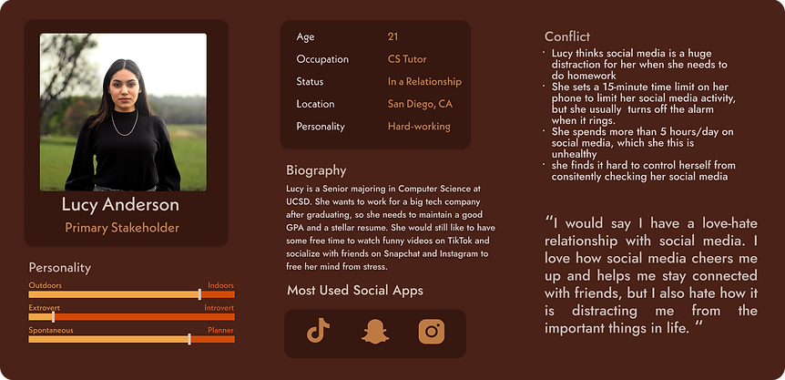
Personas
Primary Stakeholder
Secondary Stakeholder

Storyboarding
The common thread between interview and survey responses was the need to manage time spent on social media. So, we brainstormed some possible solutions:
Storyboards
.png)
Any idea belongs, even the seemingly absurd ones!

User Feedback
-
Liked the idea of group study online
-
Typically felt alone in challenging classes
-
Need an environment to feel motivated to study
-
But what if you get distracted by others on the app?
-
-
Liked the idea of focus app where you can chat with others
-
Currently uses a focus app but rewards are limited
-
No chat area to get help or motivation from others
-
We voted on our favorite ideas, and picked which pair of ideas each person would storyboard:
%201%20(1).png)
Comptetitive Analysis
What sets our app apart is how we combine various ways individuals feel rewarded in our features:
-
Connect with other who share similar goals
-
Receive encouragement from connections and ask for help through chat
-
Compete with connections on productivity hours
-
Receive tokens to customize avatar and your home page
.png)
Digital Wireframe
Pages
-
Home Page
-
Welcome!
-
Focus Timer
-
Work/School Reminders
-
-
Chat Page
-
Map of people on the app (not exact locations!)
-
Study groups
-
Create a group
-
Search for people
-
-
Stats Page
-
Weekly focus stats
-
Daily focus record
-
Focus rank (against friends)
-
-
Profile
-
Avatar store and rewards
-
Profile bio
-
Friends list
-
Acheivements
-

Testing
We created a clickable version of this design and created tasks for our friends to try and navigate through the app. This initial testing allowed us to identify user flows that did not make sense and features that were worth keeping in our next iterations of the app.
Low-Fidelity Prototype

Avatars
The ability to customize avatars in our app is one of the main motivating factor for users to complete focus blocks. On the side, I tested Figma as a tool to create characters. However, developing these characters into more polished versions proved to be too time consuming for the scope of our project.
.png)
Mid-Fidelity Prototype

User Testing
To improve our design and create a high fidelity version, we each asked a few friends to try navigating through our app. Again, we gave them tasks to accomplish with the app, and rate the difficulty of completing each task. We also wanted to know how they felt about the aesthetics and feel of the app. We wanted to see if users would feel what we intended them to while on our app (i.e. comfortable, nostalgic, welcomed).
Interactions We Changed
-
Highlight user on ranking/leaderboard.
-
Specify how many people are at each pin on map
-
Give access to notifications from all pages
-
Make the menu bar more rounded (modern) and unique to our brand
-
Get rid of whites and add more color
Style Guide
Motifs
-
Warmth
-
Nostalgia
-
Comfort
-
Inviting
-
Stress- relieving
.png)
High-Fidelity Prototype

Reflection
Challenge
Being a group of students, a great challenge was making sure everyone was contributing to the success of the project despite differences in schedules and personal priorities.
Initially, not everyone was on the same page, but the team needed everyone's help to meet tight deadlines.
My Approach
As the leader of the group, I took responsibility to encourage participation and ensure quicker progress. The following are steps I took to do so:
-
Seek to understand needs of members who were falling behind by meeting w/ them 1-on-1
-
Address scheduling conflicts and lack of meeting participation through meeting notes
-
Clarify expectations by assigning duties per team member and creating achievable deadlines
-
Make tasks less daunting for the team by leading by example
Results
-
Significant improvement in participation especially from members I spoke to 1-on-1
-
Increase in diversity of ideas
-
Significant increase in speed of progress
-
Increase in unity, trust, and collaboration among team members
I chose a higher contrast color scheme to ensure legibility. I used the coolors color contrast checker to make sure our app visually accessible. I also used a more standard format for the navigation menu to make the look more modern looking and clean.
.png)
.png)
Our intent was to communicate that when a timer starts, the individual or study group joins a virtual room that resembles a cozy house (if working alone) or a library, cafe, etc. (if joining a productive group). To communicate this more clearly, I added pictures of the physical space instead of icons. I also simplified the timer to look more simplified and modern.


.png)
.png)
I also designed a mock sign-in page to practice, implementing proper layout techniques.
.png)
Here are a few more screens where I applied the new color scheme.
Join group session
.png)
Customize profile
.png)
Find others
.png)